The dots worked great! Just lovely.
10.31.2009
plant.life.4
It's been a while, but I haven't forgotten about the baby jades in their new tin cups.
Here they are getting a pretty dot pattern top coat.
I was inspired by the letters numbers project where elements are repeated by the nature of how fonts work. So why not do that with an abstract graphic such as dots? It's easy to do with a whole punch and the repeating pattern will (hopefully) work with the repeating grooves on the tin can.
The final version is coming up soon!
10.28.2009
project.place.4
Big, big, big, project is moving long. It's what I love about what I do, one day little hand drawn letters , the next day big building.
You can see how influential the facade studies were in the development of the design of this project. The stair tower at the corner still needs a lot of work, and the scale of the building is way to big for it's site.
Back to the drawing board, or in this case photoshop to work through these issues.
(this project is being done as Project Architect with Fennick McCredie Architecture, ltd.)
10.24.2009
letters.numbers
A while back I posted a couple of sneak.peaks into a printing project I was working on. It revolved around letters, numbers and a complete lack of direction.
Thankfully, direction is now forward...few.
Here is how it's coming along...
Earlier in the process I was using a standard letter stencil to print over a simple block of color. It was a good start, but I wanted to develop unique letters that could work as a screen print. My thought was to combine the background and the form of the letter so that each read as negative in a block.
Out came the graph paper, pencil and good lighting and suddenly an entire unique block letter alphabet was right there on paper.
I then scanned it, and in photoshop worked out a few kinks like scale, proportion and composition.
Next step, prep the screen to receive the image. Messy, messy process, especially for a girl who's a bit clumsy.
10.21.2009
yes.handbags!
All I'll say about this is...
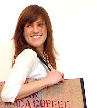
Yes, handbags! (I print and sew them)
Yes, that's me in the pictures (who can afford real models?)
and
No, I'm not actually standing on ridiculously large green plants (or sand...if you like my handbags, please visit www.maladesign.com)
project.place.3
I love to draw.
I was lucky enough to be one of the last who's architectural education still focused entirely on hand drawing. I design and think with my pencil moving across paper.
The drawings are not always pretty, but their value is in their ability to communicate an otherwise useless ability... to think.
If it were only as easy as to "think up" a design. Nope.
Hours and hours of sketching, and tracing and tracing some more.
(this project is being done as Project Architect with Fennick McCredie Architecture, ltd.)
10.19.2009
project.place.2
After the site visit last week, my new project is taking shape.
I spent a few hours on a bitter cold October morning taking it all in.
I looked, I photographed, and I sat in a warm coffee shop trying to see, and ultimately trying to understand.
I knew right away that this was not "Every-town", USA. The character of the buildings is quintessential New England Mill Town (seen in images above). It was all so familiar and I was instantly in love with the fabric of the architecture of this place; The repetition of punched openings in expanses of brick walls, the sea of pattern and texture.
I grew up in a New England mill town similar to this one with it's beautiful shimmering brick blocks by a body of water in reflected light. I recognized how the scale changes between opening and wall, solid to void from building to building. The affect is a subtly play on light that caries the eye across the surface turning solid brick masses into undulating waves.
I felt an instant connection and understanding.
The emotional aspects aside, I tackled analysis of the physical characteristics.
My intention for these diagrams is to create a lens by which the place is understood and eventually decisions are made about the new building I will design.
I chose two buildings that vary in scale and texture and broke them down in to fundamental componets. (click on images for a closer look)
Of course this analysis is only one aspect of the problem. The physical is easy, the emotional is the tough part.
I guess I'm already a little bit ahead on that front.
(this project is being done as Project Architect with Fennick McCredie Architecture, ltd.)
10.14.2009
plant.life.3
My "spark" moment has come and gone...now I need to make time to execute it. For now, here are some shots of a baby jade being put in her new tin home.
project.place
As an architect and designer I am lucky to work on project of varying scales and scope. It is one of the things I cherish about being a designer. One day I will be working on a small tin for a plant and the next a $10 million parking structure. But generally, the architectural work I do fits into the larger scale category. My most recent assignment is no exception.
I took the train this morning to the new project site. Unfortunately I can't tell you where it is...top secret, you know. But a site visit at the start of a design is critical to understanding the place I will be designing in. Physical characteristics are important, like scale and materiality. But its equally important to find the heart of a place, what makes it tick, it's physical as well as social structures.
So I headed off with my camera and my sketchbook to absorb as much as I could.
My initial observations are always the obvious stuff.
Physical Characteristics
-Industrial city bisected by a river
-Brick "factory" buildings dominate the downtown landscape
-Densely built at river's edge
Social Characteristics
-Urban "main" street shops and cafes foster lots of activity
-Art vibe
-Showing signs of economic downturn or struggle for revival (empty buildings)
It's getting past the obvious, however, that makes for good analysis. I will be designing a structure to live in this context, so understanding this place is a fundamental part of the process.
Enjoy the images.
Visit later to see my findings.
10.12.2009
never.done
I finished the prototype for the plant tins tonight, but something seems missing...
Uhhh...I worked through the design and executed it well, but it's missing something.
Spark.
What is it? How does one find it?
Well, it's just that, unknown. But until it happens, any design is just process and falls short of something inspired.
And who wants that...?
plan.life.2
If you remember from my post plant.life, I was in search of a vessel for my baby jades who had escaped the mother plant and spent the summer happily living in the moss.
There was scale and appropriateness to consider, and just as I had found the baby jades I wanted to use a found, ordinary object that was revived and given new life.
You can probably guess from the photo, Tomato Paste cans was my answer.
With the vessel chosen, the design process began by taking into consideration some of the fundamental needs of the project.
Every plant needs water and then they need it to escape, so there is a weep hole concept as well as one option with a tray to collect water.
I'm working on making the first prototype.
As often happens, in making something you discover what works and what doesn't. This process almost always results in changes to the original design and ultimately a better design.
We'll see. Off to get started.
I'll post my results later today!
10.10.2009
designer.dinner
Having friends over for dinner is such a joy.
A couple of nights ago my good friends JC and E were over for a "welcome back from your honeymoon" celebration. As soon as the invitation was sent I set out to design the menu for the evening.
Like any good design, a great meal start with defining the problem. And in my kitchen, it always starts with the people coming to dinner. JC and E love and appreciate great food.
And so I started with steak!
Not just any old steak, T-bone steak from the midwest! I had never really tasted meat until I had it from the heartland of our country. Trust me when I tell you, it changed my world! I have my boyfriend to thank for this life altering experience...and so the last two steaks we wanted to share with our friends.
With steak as the centerpiece I put in place a few guidelines:
-Seasonal-Autumn
-Many courses to "fill" the night with food
-A thread that tied dishes together
-Include Figs(E's Favorite)!
Once I had the framwork, making decisions came much more easily. I wouldn't have time for labor intensive dished so I went with easy, simple classics that could mostly be made ahead. The addition of special touches like Fig Balsamic, Black Truffle Oil, and Olive oil elevated the classics and ties all the dishes together.
E was super excited and loved the special figs I made for her.
Next was a hearty Minestrone Soup with parmesan cheese fresh croutons and a drizzle of an amazing olive oil I bought on my last trip to Napa at Vincent Arroyo Winery .
Grilled T-bone steak, (insert sigh here) roasted winter squash, mashed potatoes with a drizzle of Black Truffle oil and thyme.
And of course desert. A Tart Tatin!
Caramel apples made a sweet (but not too sweet) ending to a lovely dinner with friends.
One last thing. JC brought his camera along and took all these wonderful photos of our evening. Thanks JC. You captured the meal perfectly!
10.07.2009
plant.life.
It's October, and it's getting chilly here in Boston. Brrrr.
Fall, of course, brings with it the pleasures of apple picking and thick cable knit sweaters, but it also means it's time for my little succulents to come inside off the ledge.
I am lucky enough to have a little plot of roof where in one area the moss grows naturally in the shade and in another the pebbles, warmed by the sun, feel so lovely on my bare feet in summer.
My plants love their ledge. They get to be outside for the few months it is warm and I get to watch them blossom and turn a beautiful deep chartreuse.
I especially love the jade tree that occupies one corner. I must confess it is not mine. My friend JC has asked me to "babysit" it for him until he finds a home for her. But here on my ledge, The Jade, as she's called, enjoys five months in dappled sunlight filtered by the tree nearby and the occasional company of my cat Phoenix.
This spring, as usual, I put her out to spend the summer.
But a curious thing happened this year. A few of the longer, heavier branches dropped their baby young jade leaves from their ends.
And what did they do...they took root right there in the moss bellow and grew all summer perfectly happy in their moist new home.
Inspiration strikes as the strangest moments.
I climbed out there yesterday, and sadly brought The Jade indoors. The little babies just stared at me wondering, I think, what I would do with them.
I was wondering too.
I began to think about the cycle of life and how things are so precious and needed at one moment, and the next become cast-aways. These little living things found their own new home in the moss, and maybe, just maybe I could find a new one for them.
My first thought was to repurpose something that had once been useful and now no longer served it's purpose.
There were also the issues of scale, capacity to hold dirt, drainage, and of course appropriateness.
A great, unexpected inspiration is sometimes the first step, but after that it's about process. Identifying the problem and working through it to it's ultimate solution.
I have a few ideas already, am working on testing them and will share them with you in my next post!
For now, off to rescue some forgotten vessels!
10.04.2009
Travel.to
There is something about airports...
For me it's a combination of the anticipation of travel to a far away land and a familiarity that comes from having worked on design for a few.
My favorite part, however, is leaving the airport, making my way down the jetbridge and finding myself at the little round window to the world.
It's magical.
You enter what is essentially a very well designed aluminum cylinder that bullets through air, time and space to deposit you somewhere else, somewhere new, somewhere you have never been.
Why it reminds me of those first moments and days of a design problem, I don't know. But it does and it is. You start somewhere and you emerge somewhere completely different.
10.02.2009
sneak.peak 2
I'm making slow but steady progress on the letters/numbers project.
But, what happens when you have weekend house guests and your studio is a "slash" guestroom...?
Will put this on hold till next week and enjoy the beautiful fall days we have been having in Boston.
10.01.2009
kitchen.kitchen.and one more kitchen
I recently bought the condo I have been living in for some time. It's a great loft space in an old High School. The neighborhood (Jamaica Plain) is funky and populated with interesting people, their dogs and lately it seems an onslaught of cute toddlers.
There are big old tudor houses and weeping willows, great places to eat and a farmer's market on Saturdays. Although sadly that will end soon as the bitter new England winter sets in.
But to the point of my post...
This building was renovated and made into apartments in the 80's. A time when developers where cutting corners and dry wall was the greatest thing since sliced bread.
It's also about as boring as sliced bread.
So, as we sell apartments and fresh young faces start to populate the halls, the itch to start taring down drywall and renovation is inevitable. I've been asked by some neighbors for ideas, and the kitchen seems to be the biggest problem area.
Most of them are small, cramped, galley kitchens with old appliances and dreadful "wood" cabinets.
I took out my drafting tools and went to work.
I designed three options for what was a boring old galley, each offering a different feature.
No clients yet, but the ideas are circulating and I'd love to see a few of these built!
KITCHEN C: Storage Wall if you really cook and have lots of stuff. The asymmetry of the plan adds drama.
Subscribe to:
Posts (Atom)